One of the main things one can look at before entering any given building or house is the door; a door can have detailed information on what is happening inside a home. It, therefore, means we get well-described details on what we might encounter when deciding before entering a house. So if at the entrance we have some warning information entry is difficult.
Similarly, a homepage is essential when it comes to user attractiveness. But, again, design and appearance speak volumes about whether the laid process will continue or stop immediately.
In this piece, we shall center on the critical components of an effective homepage to give rise to thriving marketing. First, however, it is imperative to incorporate and include the definition of a homepage so that we can be on par with each other.
A homepage refers to the default page that first appears when visitors or users load a URL. It is always under the control of site management.
For a great homepage in place for most effective marketing, there are several elements your homepage should bear.
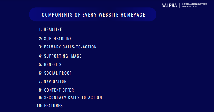
Components of every website homepage
Headline
A headline refers to a phrase note that long that appears at the top or beginning of a homepage. A given website should lay to its visitor’s information containing what its business should offer. A few short words should avoid boredom.
One would worry about capturing the attention of every visitor who comes across your website, but that should not be the case. So instead, consider writing a headline in words that will be capable of capturing a third of your visitors or users who are likely to get interested in your products and services as well.
Use the most suitable layman’s language to embrace the simplicity of conveying information to your clients and visitors. However, some attention-capturing words are also crucial to avoid normalcy.
Sub-headline
A sub-headline section is also of importance since it plays the role of backing up the headline. In addition, it supplements it by describing services offered at a given business-oriented organization.
Since here we are after being brief, and to the point, an effective sub-headline is possible by going straight to what your product is associated with. It should also be attractive and eye-catching to make a visitor interested in it to the extent of accessing the main content.
Correct magnified fonts are crucial to ensure visitors to your website find no hard time getting the content of your sub-headline. Therefore, the use of relatively sizable fonts that do not overwhelm the users during visits is essential
It is good that our page editors have types of fonts to use for heading and sub-headings. Types of titles occur in ascending numerical order depending on the header. Therefore, headings provided on your editor are essential in chronological order depending on the number of headings you have on your homepage.
Primary calls-to-Action
Your homepage’s main aim is to attract visitors and users to go deeper into your website and have them accomplish your homepage goal. Since this forms the primary purpose of your homepage, one is supposed to compel his or her visitors with at most three calls to action that are responsible for directing the people to several different stages of accessing the item.
CTAs should always be attractive and eye-catching. Make use of a color different from the one on the background of your homepage for an easier visionary. Also, using QR codes as calls to action, it’s essential to ensure that the landing pages or content they lead to are mobile-friendly and provide a positive user experience. You can create a QR code by using QR code generator tool online.
Supporting image
Since most people who access your website can see, it is good to accompany your homepage with an appropriate supporting image that briefly describes the quality of your products. Even a short video is essential here because it is emotional and can compel visitors to go deeper and find out more about your item on marketing.
For image optimization, kindly use a high-quality image accompanied by reduced size and add text to your pictures so that it can be effective for those readers who use screen readers. To reduce the size and increase the quality of an image, one can use exceptional soft wares like the TinyPNG we know.
Benefits
Everything is purposeful and beneficial. So it is good for one to consider including the benefits of their products; perhaps they can be a solution to the visitor to your website.
Benefits should be written in their simplest forms considering your clients’ language. For example, benefit listing in a product is possible with Evernote, which does it in the best way possible that compels visitors.
Social proof
Social proof is one of the ways one can be proud of their product even if people won’t believe it, but it could be the best in that line.
In proving, it is crucial to include quite a few best short quotes to complement your product on the homepage. To add to this, one can include testimonial images and the best comments from clients who have already benefitted from your products.
Navigation
Directing visitors to the homepage is essential by giving them a well-defined link or path to the required pages.
Navigation is one element that can only be improved by those who have a hand designing the website. Thus, it is your responsibility to carry out a test to ensure that it is user-friendly to the visitors.
Content offer
A homepage is best with some good quality content offered. It is easy to display as a whitepaper, eBook, or guide that a visitor can also download to acquire more information about the topic
Secondary Calls-to-Action
Secondary CTAs play a vital role in converting visitors who the first displayed content on the homepage might not have captured.
As opposed to primary CTAs being above the fold, secondary CTAs require placement before the fold to persuade those visitors who might not be ready to engage in higher commitments like the one on your homepage.
Features
Features are always fundamental aspects of marketing products. Additional content of features to your homepage makes visitors know more about your product and compare with what they need. In this section, you ought also to keep this kind of copy in an easy-to-read form and light.
The above ten components serve as the main elements of a good homepage for effective marketing of one’s product. There are two more that are not considered primary but also improve the appearance of your homepage. They include;
Resources-it is an essential tool for visitors who are not yet ready to buy but are interested to know more; that is where the resource center comes in. Resource forms part where they can obtain more information on an item.
A resource has the advantages of making the client stay on the website for long and improving one’s credibility.
Success comments involve satisfied customer success stories based on the product they purchased from your website. They should also include some awards and recognition that can draw a visitor closer to the product to the extent of being interested to know more about your item.
All of the above elements simplify that a homepage is critical when it comes to effective marketing and that the best is needed to attract visitors and customers well attracted and rooted to your website in case they need your services and products. None of the components above is meaningless; all should be given equal weight for the success and thriving of your business.
Conclusion
Following the above guidelines to the latter will result in coming up with the most potent homepage that will aid in thriving your business through appropriate marketing. We have come to understand that a homepage is not just a communication tool; its appearance, format, and organization fascinate your clients. In addition, the mentioned elements should occur in the order in which they follow each other systematically, meaning that as much as you have a good homepage, the content order is very critical. Lastly, we need to understand that the homepage should be of considerable length to avoid biases and boredom to those visitors on your website, only touch on the main and critical points of your product.
Finally, consider connecting with highly experienced web development company who can help you to develop an eye catchy as well as lead generating website homepage so that you can grow your business successfully.


Share This Article:
Written by:
Muzammil K
Muzammil K is the Marketing Manager at Aalpha Information Systems, where he leads marketing efforts to drive business growth. With a passion for marketing strategy and a commitment to results, he's dedicated to helping the company succeed in the ever-changing digital landscape.
Muzammil K is the Marketing Manager at Aalpha Information Systems, where he leads marketing efforts to drive business growth. With a passion for marketing strategy and a commitment to results, he's dedicated to helping the company succeed in the ever-changing digital landscape.