With UX design, there is yet more to understand. In this piece, our concerns will strike through UX common dark patterns. Right from the word “dark pattern,” you’d sense something isn’t right. Well, let’s delve into “dark patterns” and all it has for the UX consumer. Dark patterns are in UX design, tricks that, when not carefully attended to, can manipulate and redirect a user to act forcefully with no otherwise. Such patterns make the user perform an action they did not initially want to accomplish. The current digital space is full of UX dark patterns, and most users struggle with them with no prior knowledge of what they are and what they intend to perform.
For this reason, this piece takes you through the UX common dark patterns and the possible ways you maneuver in countering them. At some point, you will find out that manipulative have a crucial role on the owner of the website or application. For instance, the website owners mostly look forward to achieving more clicks, subscriptions among more. But on the user’s side, it can be more disadvantageous given that they get to do things they don’t desire.
Most businesses believe that dark patterns are an essential pathway towards increasing subscription rates. Still, realistically, it hurts the user who wastes time forcefully performing an action they didn’t want to accomplish. Therefore, they are manipulative designs because, on most occasions, they manipulate the user.
Common types of dark patterns in UX
There are many types of dark patterns in UX, but meanwhile, we shall narrow down to a few of them so that you may have a proper understanding of some of these manipulative designs.
-
Bait and Switch
The data pattern’s name speaks volumes about it. It is a manipulative design that fakes data and sets it forward. Usually, the data centers mainly on the user’s interest and the periods within which the user has an interest. Once the user finds the information exciting and taps the button for a move-ahead, initial data or information switches to something different, it is a common trick utilized by most businesses to increase schemes rapidly.
-
Hidden Costs
You might have encountered a product online with a relatively lower price that escalates your interest for its cheapness. A follow-up on the product results in shockingly increased prices from taxes and delivery fees as you move with the checkout. Such a dark pattern is a hidden cost.
-
Forced Continuity
Forced continuity is another manipulative pattern that stimulates the user to start a free trial by submitting personal details such as card details. After that, the user has no option to revert the process – the choice to skip the self-interest gimmick is neither an option, and the user has no choice but to continue the registration to the end.
-
Disguised Ads
It is a manipulative pattern that occurs as an advertisement banner masquerading on a website or app and that seems to have valuable content that may entice the user. Once users find it as the valuable content they are looking for, they click on it and discover that they have been spam victims.
-
Roach Motel
In this dark pattern, the entrance or the signup process into a given platform is more straightforward and relatively faster. It is worth your look and consideration. However, exiting can be a pain in the next. It is almost close to impossible – it is a roach motel. A good instance of a roach motel finding a subscription much easier while the unsubscription option becomes unavailable upon your desire to exit.
-
Asking More than Intended
Various applications may sometimes ask for more than intended user information and thus can mistrust the use. It is one of the common UX patterns existing, and it’s purposefully for sourcing as much information as possible from the user.
-
Triggering Fear
It is one of the typical UX dark patterns whose primary focus is to trigger fear in a user who has no much knowledge of using the site or application. In most cases, once a user signs in the application or subscription, some terms trigger fear in the user once they desire to opt-out. Such threats often relate to misleading words and assurance of negative consequences once one plans to quit.
-
Triggering Fear of Missing Out
The dark pattern’s common areas are the e-commerce websites. For instance, there are timing elements where the user gets lured into believing they only have minimal time to act, get an offer, or purchase a product. Mostly, the aim is to increase order volumes on e-commerce websites.
Check: UX design company in India
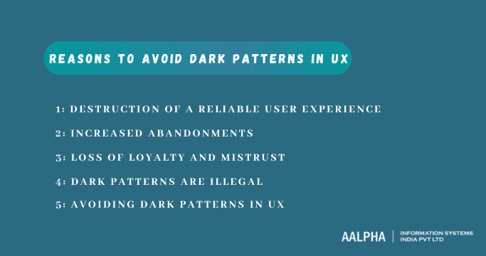
Reasons to Avoid Dark Patterns in UX
The use of dark patterns may seem more important, productive, and irresistible, but at times, it comes with a set of consequences. For instance, a site or app could lose customer’s trust. The following are among the reasons why you should avoid the use of dark patterns in applications or websites:
-
Destruction of a reliable user experience
Among the reasons why companies lose customers to other companies is poor customer experience. Usually, pulling customers closer and closer goes hand in hand with generating reliable satisfaction among the customers. Once dark patterns ruin the user experience, customers become dissatisfied and opt for better options. As a result, there can be a dwindle in profits and a reduction in revenue.
-
Increased Abandonments
The current state of awareness among users is not worth trying out a thing that could dissatisfy them – they are more aware than before. Most users have a greater preference for straight-to-the-point content, and therefore the use of UX dark patterns and tricks could compromise their comfort in different ways. It will, in turn, result in a considerable number of abandonments.
-
Loss of loyalty and mistrust
Security is currently an issue to ponder, primarily when operating in online environments. Therefore, using dark patterns and tricks can generate fear, mistrust, and disloyalty among users who fear the state of security within the application or website. Newbies will likely immediately leave sites and apps whose practices are uncalled-for.
-
Dark patterns are illegal
The legality of dark patterns isn’t justified. Therefore, it is illegal to have “dark patterns” on your website or application as it could lead to penalization.
-
Avoiding dark patterns in UX
Dark patterns can, at times, be a great bother to the users. Therefore, it is essential to try and evade these patterns to fool and mislead the users, leading to frustrations, impatience, and confusion. Therefore, business owners should try as much as possible to evade the usage of dark patterns. Some of the crucial techniques to avoid dark patterns in UX include introducing stringent design practice protocols, enhancing the preference for user experience, providing tremendous favor on user interests, following ethical UX design processes, and conducting extensive research on user expectations.
Conclusion
With dark patterns, you can have more leads and conversations more than you could imagine. However, the notable point is that your main development aim is to enhance the user experience that doesn’t come from the dark patterns. Dark patterns are terrible distractors of user experience and, therefore, the need to avoid them. Consequently, development teams must follow proper design procedures and avoid using dark patterns that ruin the user experience.


Share This Article:
Written by:
Muzammil K
Muzammil K is the Marketing Manager at Aalpha Information Systems, where he leads marketing efforts to drive business growth. With a passion for marketing strategy and a commitment to results, he's dedicated to helping the company succeed in the ever-changing digital landscape.
Muzammil K is the Marketing Manager at Aalpha Information Systems, where he leads marketing efforts to drive business growth. With a passion for marketing strategy and a commitment to results, he's dedicated to helping the company succeed in the ever-changing digital landscape.