Most people will agree that physical appearance effortlessly defines something to conclude efficiently. A good example is the dressing code most of us use. The type of occasion always accompanies designing; formal occasions work well with traditional dressing. Just like our appearance matters, landing pages should be one of a kind to ensure that it captures and draws the users’ attention as much as possible.
Landing pages refer to the immediate standalone web page that a user bumps to immediately when they click on the given email, an ad, or either location displayed on his screen. On reaching the landing page, the users are encouraged to participate in the activities shown, either buying or joining the list. So you can see that landing pages require designing in the best way possible for their role is very important.
Characteristics of best landing pages
Consequently, with the power of the best landing pages, what can we do to create the most eye-catching and interactive designs? As much as we need quality, can we have some of the super characteristics of good-looking land pages that require a consistent display to draw our attention? Then that’s what we shall look at next in this article.
-
A précise landing page
Mainly, the role of a landing page is to entice the user to take action and nothing else. Therefore, a landing page should be able to convince the users to accurately do whatever is indicated on it regardless of what it dictates, including forms for interaction with the user, making a purchase, or even downloading a particular file should be clear and to the point.
-
Good content spacing.
Each section of content in a land page should have clear separation and spacing from each other that are used for good backgrounds and white spaces to provide a reliable visual break.
-
The text should be clean
In addition, the more quickly a user finds it to read your text on the landing page, the more one is near to the success of his mission. One is supposed to use easily readable fonts, and styles should not be confusing with excellent and appropriate spacing. Lengthy blocks of texts are also discouraged as they may cause bias to the reader and the user.
-
Making use of pictures and images
Alongside the text, visual information, including pictures and images that appertain to the subject on the landing page, makes it more attractive to the user. Photographs and messages can also define and give an overview of your overall message; they include charts or diagrams that quickly summarize the subject.
-
Use of various color schemes
Appealing colors to be used most is always personal. Each of us has their color taste, which can be challenging. Still, you will agree with me that a landing page with nice blended colors can duly play a significant role in soothing the user on the page.
Above are just a summary of the characteristics crucial to developing a well attractive landing page to succeed in your goal.
Types of landing pages
Let us go through some good examples of landing pages that one can use, but why can’t we consider the types we have and then look at the examples in this article as we continue inspiration to designing the best landing pages?
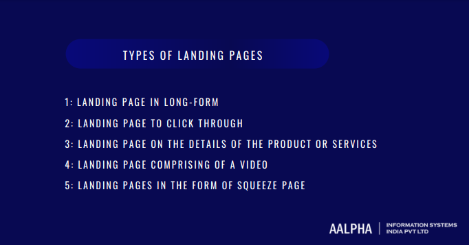
We have several types of landing pages, some of which we are going to look at in this section, as illustrated below
-
Landing page in long-form
Here, the landing page is informal and crucial in digital marketing. It has a unique way of convincing the user, focusing most on the benefits of the products involved and repeating the benefits frequently until they capture the user. The chances of converting as a user depend on the longer the time a user stays on this page. However, it requires concise as well as purposeful content.
Long-form landing pages sell an item; thus, they keep repeating phrases repeatedly to capture your attention.
-
Landing page to click through
Unlike the long-form landing page, clicking through a landing page provides sufficient information that keeps people from visiting certain transaction pages. As the user comes across their mentioned page, they focus on giving adequate details about the purchase and benefits.
They should click- through the landing page best for the user or consumer who may be interested in the services but have doubts regarding the organization in place.
-
Landing page on the details of the product or services
The business’s main website becomes beneficial for this type of landing page. The product details page provides all the information that a user may need or is interested in. Here, the visitor can read the detailed information, complete the process, or even contact the stakeholders for more details and elaboration.
Product detail pages are easy to create because they are located right within the structure of the main website, and they serve businesses to give information about their commodity and services.
-
Landing page comprising of a video
The landing page will include a video on the services or products sold therein. The location of the video is above the page since it carries the organization’s primary content, which is why this type of landing page may include a video or sometimes accompanied by a few complementary texts to boost the tape in place. The included video should cover an explanation of the commodity or service and build up hype for it. It should be a few minutes long and not so long to avoid boredom.
You can agree with me that in the present day world, videos play a very vital role in terms of advertisement and thus are capable of attracting the user’s attention for a couple of minutes. Persuasion of this kind can result in the video’s goal being successful. Videos are also efficient for one to remember something, even if it is just at a glance.
-
Landing pages in the form of squeeze page
The squeeze page always aims to pursue the user to quickly fill their personal information in a given provided purposefully to capture one’s as fast as possible and keep track of them.
Squeeze pages dominate organizations seeking to generate their email lists for the first time to capture users’ details swiftly. Importantly, integrating your landing page forms with an email verification API ensures that only accurate and up-to-date email addresses are collected from first-time users.
Design examples for landing page
Some eye-catching examples of good landing pages have a place in this section. First, however, to mention a few since they are several just depending on the demands of a given organization.
-
Paramount plus
Paramount plus example of landing page has all the features required to soothe and attract a user to access the content displayed. Most appreciable features contained here include being attractive, visually appealing, and able to give out scan-able at the same time detailed and descriptive headers like Peak Originals to the users.
-
Educate
In this type of landing page, the type of your audience matters a lot since its content focuses on students with information favoring them for further directions in their education.
Parents can also be beneficial from Edupath based on the fact that it can give them directions and advice on the steps they can take and help their teenagers in terms of course applications, among other educational directed programs
A unique feature of Edupath is that it is easy because it only comprises a one-click process and captures students’ attention through their parents. It ensures that students can only do something if they are asked to by their parents.
-
Wix
Wix has some unique features that make it available for use as a type of landing page because they have incorporated it to be well balanced so that it is not overwhelming or distracting. In addition, Wix engages in the employment of very stunning and captivating digital illustrations.
-
Zola
It is among the widely used types of a landing pages, especially for those working with an online retailer or a wedding industry. The Zola design is excellent.
Zola’s page appears attractive because of the consistent branding of grey –bluish shades and its simplicity, thus enabling more users to access it even if they bump onto it for the first time.
-
Lujo
Lujo uses the Z-pattern landing page and is always able to lay the required content without overwhelming the user.
Outstanding characteristics of Lujo include and are not limited to having stunning visuals and making use of prominent USP; thus, the user won’t stay long on the page before clicking the CTA button.
Conclusion
In this piece of work landing page has been expounded exhaustively with a variety of examples and types of best landing pages. However, it would help if you improved landing pages, as it is an inspiration for the design of landing pages.
Finally, consider to partner for better website design services in order to get an attractive and high converting landing page design for your business.
Also read: landing page development cost


Share This Article:
Written by:
Muzammil K
Muzammil K is the Marketing Manager at Aalpha Information Systems, where he leads marketing efforts to drive business growth. With a passion for marketing strategy and a commitment to results, he's dedicated to helping the company succeed in the ever-changing digital landscape.
Muzammil K is the Marketing Manager at Aalpha Information Systems, where he leads marketing efforts to drive business growth. With a passion for marketing strategy and a commitment to results, he's dedicated to helping the company succeed in the ever-changing digital landscape.